mentioned she liked reading my rants on how websites are built, and since I’m in the website-building business, it makes sense that I’d have some insights on what’s what. This is not to say that I’m an authority on how sites should be built, nor am I the only one spending time nitpicking. There are sites that focus on the whole package, like Sitecritic.net and Web Pages That Suck – both of which, for some reason, have pretty bad UI – but are thorough and well-written. As a developer, not a designer, I’ll try to focus mostly on use of code, and how websites that look just fine could greatly benefit from a bit of code rewriting.
(I don’t know if I’m going to write even more than one of these, so I decided I’d stick this on my personal blog for now.)
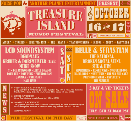
The lineup for the 2010 Treasure Island Music Festival was released yesterday. I’m pretty excited about everything on day 1 (being more of an electronic than indie guy). The color scheme for this year is a little strange (reminds me of a rotten fruit salad) but otherwise I like the design they’re going for. I was a bit appalled when I took a look at the code and a hodgepodge of tables jumped out at me.
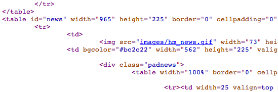
There’s a myth that the <table> element is an awful, taboo, even deprecated thing that shouldn’t even be thought about when it comes to putting a site together. It’s false: <table> is great for, well, tables. Spreadsheets. Charts of data. Anything that can be logically arranged in rows and columns. But I don’t see any spreadsheets on this page:
In fact, I don’t see any rows or columns at all, in a traditional sense. I suspect tables were used to “speed up” development, as this reeks of a “slice and dice” job, where the developer was given a mockup and he decided, for some reason, to splice it into tiny bits and shove it into a series of convoluted tables with rowspans and colspans.
Bottom line: splicing is baaaad. I can’t think of a situation in which splicing would be a good thing to do. When you splice a PSD into tiny images and scatter them throughout a page, you do a few things:
- You waste time taking apart an existing design and putting it back together, when you don’t have to
- You make a page hard to maintain – what if the design changes?
- You increase the amount of HTTP requests by a buttload
- You doom a page’s SEO value by increasing load times, removing any opportunities to make a page semantic and machine-readable
The developer, instead, could have exported the entire design as a single PNG (oh god, I just noticed that they’re all GIFs), set it up as the background of the main site container, and overlaid some absolutely-positioned lists, whose text content is hidden via CSS. That is to say, the site with styles disabled would look something like this:
Treasure Island Music Festival
October 16 & 17, 2010
- LCD Soundsystem
- Deadmau5
- etc…
- Belle & Sebastian
- The National
- etc…
And with CSS implemented, the site would still look like it does above.
I am generalizing in one area, though, and that’s with hover states. If you yearn for the days when your visitors could be whisked away to a magic cyberspace of interactivity, then I guess you gotta implement your danged hover states one way or another, so you do have to splice the PSD and save the images individually (or turn them into sprites, or something equally clever), and use CSS to specify what shows up when you hover where. Instead, this site uses a horrid cocktail of JavaScript and invalid HTML attributes (srcover? oldsrc???).
In general, this a site that, despite being functional and pretty-looking, makes me want to smack the developer upside the head. It lives in a world where <table>, <div>, and <img> are the only HTML elements worth using, substitutes CSS for deprecated/invalid HTML attributes, loads a million images when in a perfect world it wouldn’t have to load any (web fonts! SVG! etc.!…), and sacrifices any chance of being accessible to search engine bots or those with disabilities (no meta tags, no alt text, not a hint of semantic HTML usage).
Boy, this was kind of therapeutic. If you found this at all interesting, feel free to send me some more examples. I’m looking to rant about recent, small-scale sites that aren’t overtly horrible but could use some work. Or I’ll find ’em instead.
This is great! The sites you mention above that already do this focus mainly on design, and a lot of what they talk about is very ‘duh.’ At least to me, poor design is much more intuitive than poor development. I second guess myself when I think something could be as simple as backgrounding an image like that, so it’s good to have stuff like this hammered into my head.
i doubt they will get their shit together. i once had a moment of nostalgia and played ffix again for about ten minutes. after playing a number of other, better mmo’s, it was just…awful. and that was after having been out for like five years. so…yeah, they’re not really into that whole continual improvement thing. i couldn’t even get the beta to run on my computer, so i don’t even get to have an opinion from personal experience. from what i’ve seen/heard in other people’s reviews, though, it’s essentially ffix part 2. and if we’ve learned anything from ffx-2, it’s that they suck at making sequels.